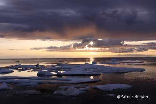
Why Canada’s new official map shows the Arctic with more sea ice?
The new edition of the federal government’s map of Canada presented a few days ago will likely surprise many of us by showing more sea ice over the Arctic Ocean.
This version may be very confusing for the public, young students, schools… when knowing that statelite pictures, scientists and green organisations are explaining that the Arctic Ocean sea ice has been melting over the years in an alarming manner!
Even more, when many are predicting that summertime sea ice in the Arctic could disappear by the second half of this century, even before in the short coming years!
What’s the explanation then?
This new map edition 2015 appears with more sea ice (see here below, the 1st picture) because it was designed using a 30-year median of sea-ice extent in September of every year, from 1981 to 2010. Sea ice levels are at a minimum in September.
The Globe newspaper reported : “…the 2006 map showed permanent sea ice (see here below picture) that covered northern waters throughout the year…”. “Both are correct,” Christopher Storie, president of the Canadian Cartographic Association, told the newspaper… “They’ve provided the right notation for the representation, but not many people will read that or understand what it means.“
This post is also available in: Chino simplificado, Inglés


